Permission UX
The natural step after getting a PushSubscription and saving it our server is to trigger a push message, but there is one thing I flagrantly glossed over. The user experience when asking for permission from the user to send them push messages.
Sadly, very few sites give much consideration as to how they ask their user for permission, so let’s take a brief aside to look at both good and bad UX.
Common Patterns
There have been a few common patterns emerging that should guide and help you when deciding what is best for your users and use case.
Value Proposition
Ask users to subscribe to push at a time when the benefit is obvious.
For example, a user has just bought an item on an online store and finished the checkout flow. The site can then offer updates on the delivery status.
There are a range of situations where this approach works:
- A particular item is out of stock, would you like to be notified when it’s next available?
- This breaking news story will be regularly updated, would you like to be notified as the story develops?
- You’re the highest bidder, would you like to be notified if you are outbid?
These are all points where the user has invested in your service and there is a clear value proposition for them to enable push notifications.
Owen Campbell-Moore created a mock of a hypothetical airline website to demonstrate this approach.
After the user has booked a flight it asks if the user would like notifications in case of flight delays.
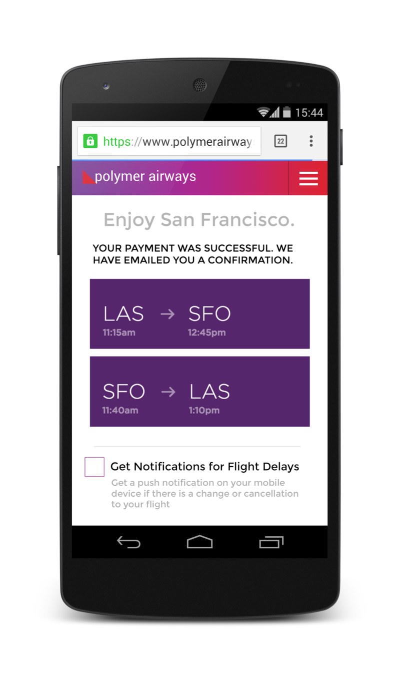
Note that this is a custom UI from the website.
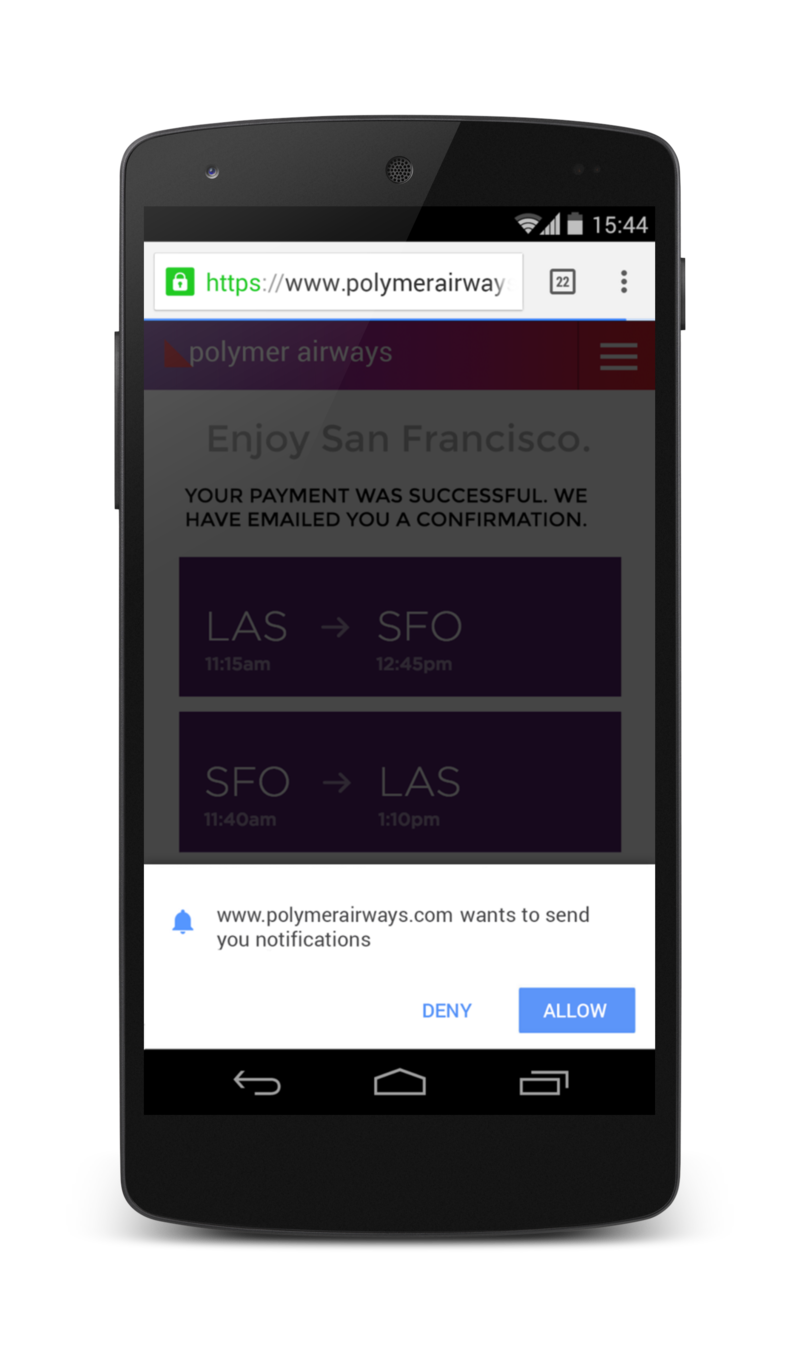
Another nice touch to Owen’s demo is that if the user clicks to enable notifications, the site adds a semi-transparent overlay over the entire page when it shows the permission prompt. This draws the users attention to the permission prompt.
The alternative to this example, the bad UX for asking permission, is to request permission as soon as a user lands on the airline’s site.
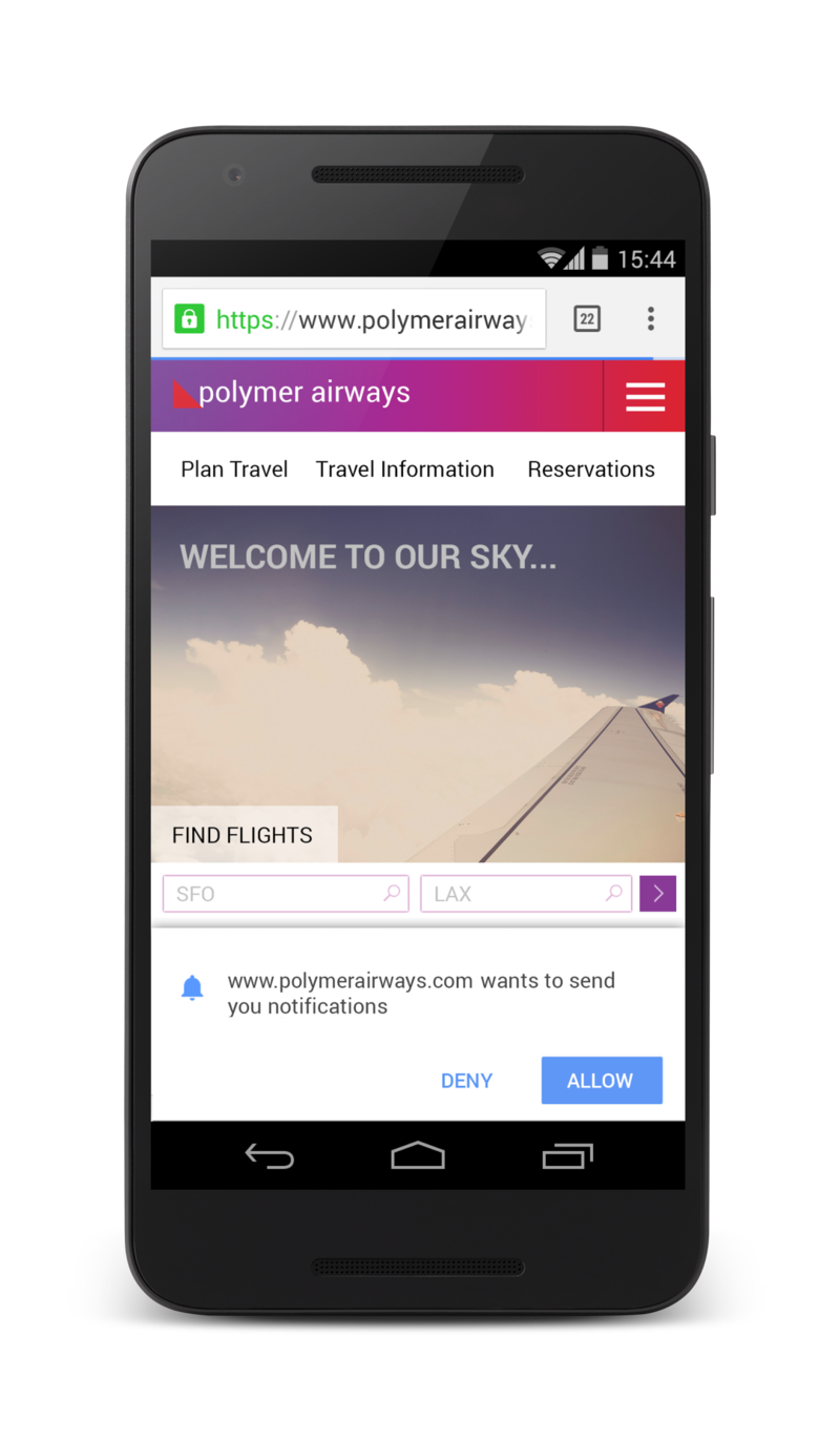
This approach provides no context as to why notifications are needed or useful to the user. The user is also blocked from achieving their original task (i.e. book a flight) by this permission prompt.
Double Permission
You may feel that your site has a clear use case for push messaging and as a result want to ask the user for permission as soon as possible.
For example instant messaging and email clients. Showing a message for a new message or email is an established user experience across a range of platforms.
For these category of apps, it’s worth considering the double permission pattern.
With this approach you display a custom permission prompt in your web app which asks the user to enable notifications. By doing this the user can chose enable or disable without your website running the risk of being permanently blocked. If the user selects enable on the custom UI, display the actual permission prompt, otherwise hide your custom pop-up and ask some other time.
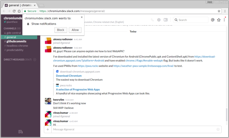
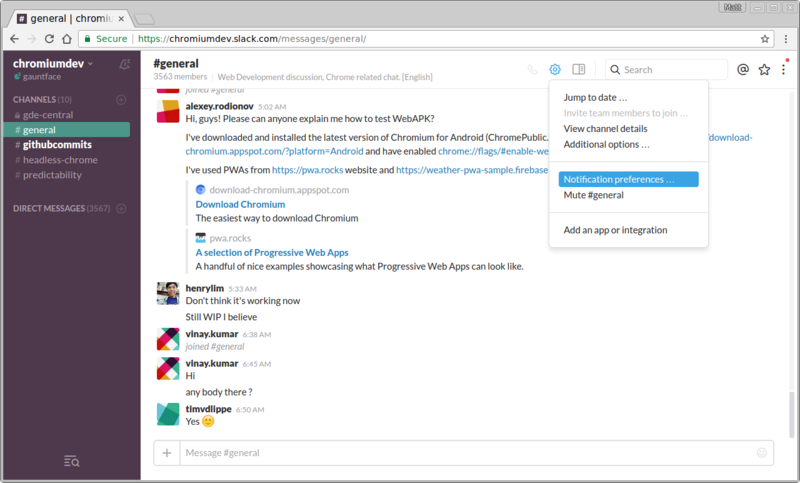
A good example of this is Slack. They show a prompt at the top of their page once you’ve signed in asking if you’d like to enable notifications.
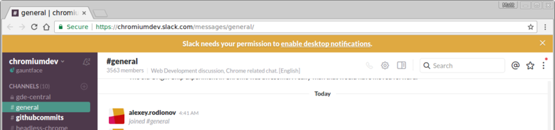
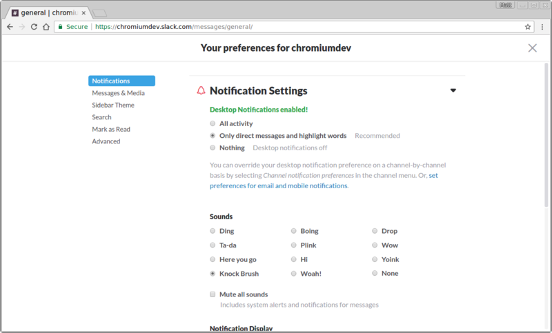
If the user clicks accept, the actual permission prompt is shown:
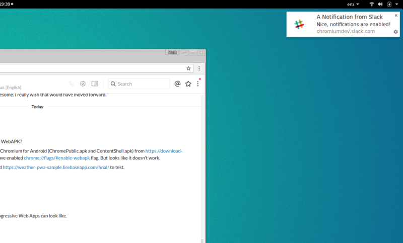
I was also a big fan of Slacks first notification when you allow the permission.
Settings Panel
You can move notifications into a settings panel, giving users an easy way to enable and disable push messaging, without the need of cluttering your web app’s UI.
A good example of this is Google I/O’s 2016 site. When you first load up the Google I/O site, you aren’t asked to do anything, the user is left to explore the site.
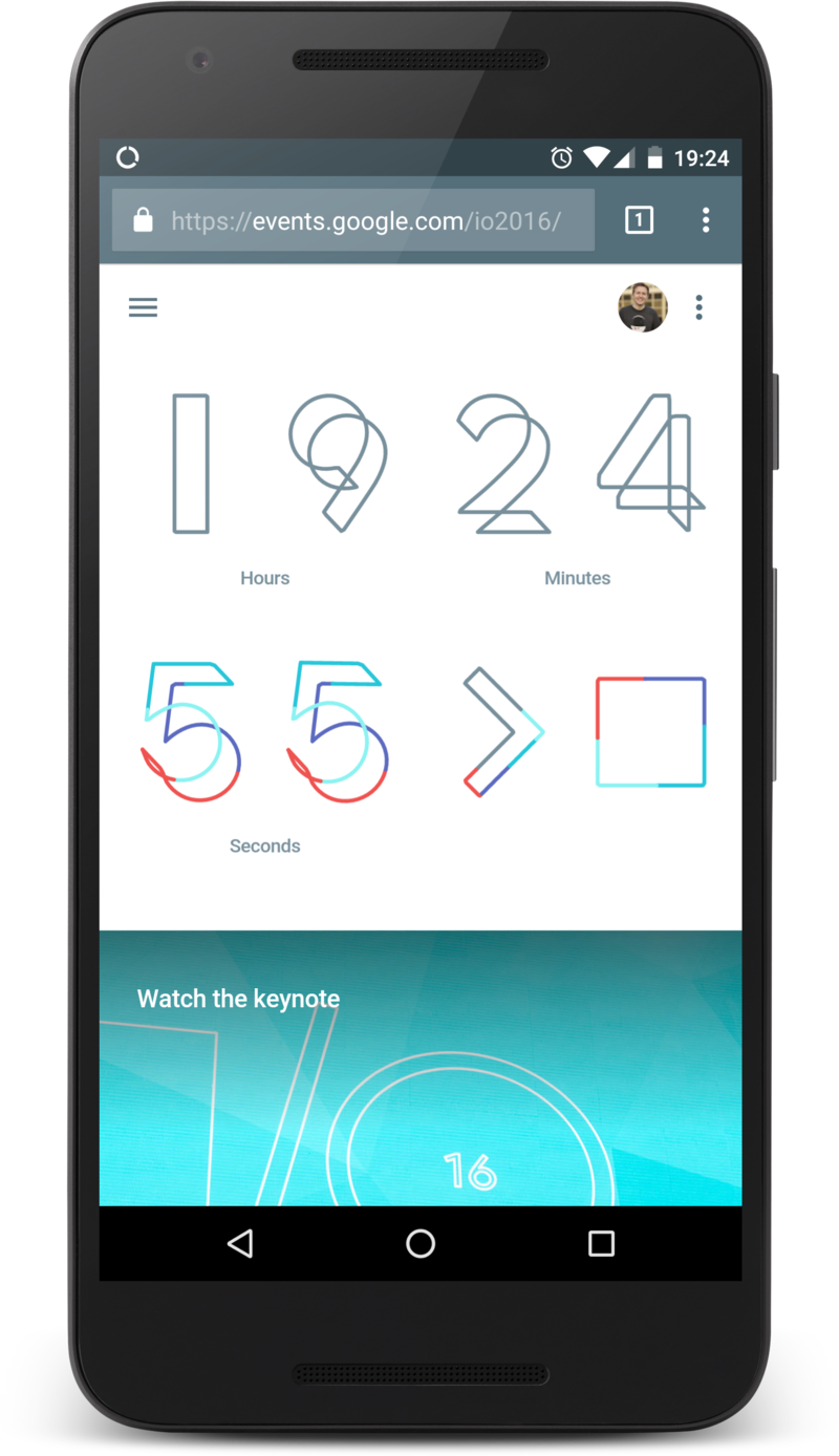
After a few visits, clicking the menu item on the right reveals a settings panel allowing the user to set up and manage notifications.
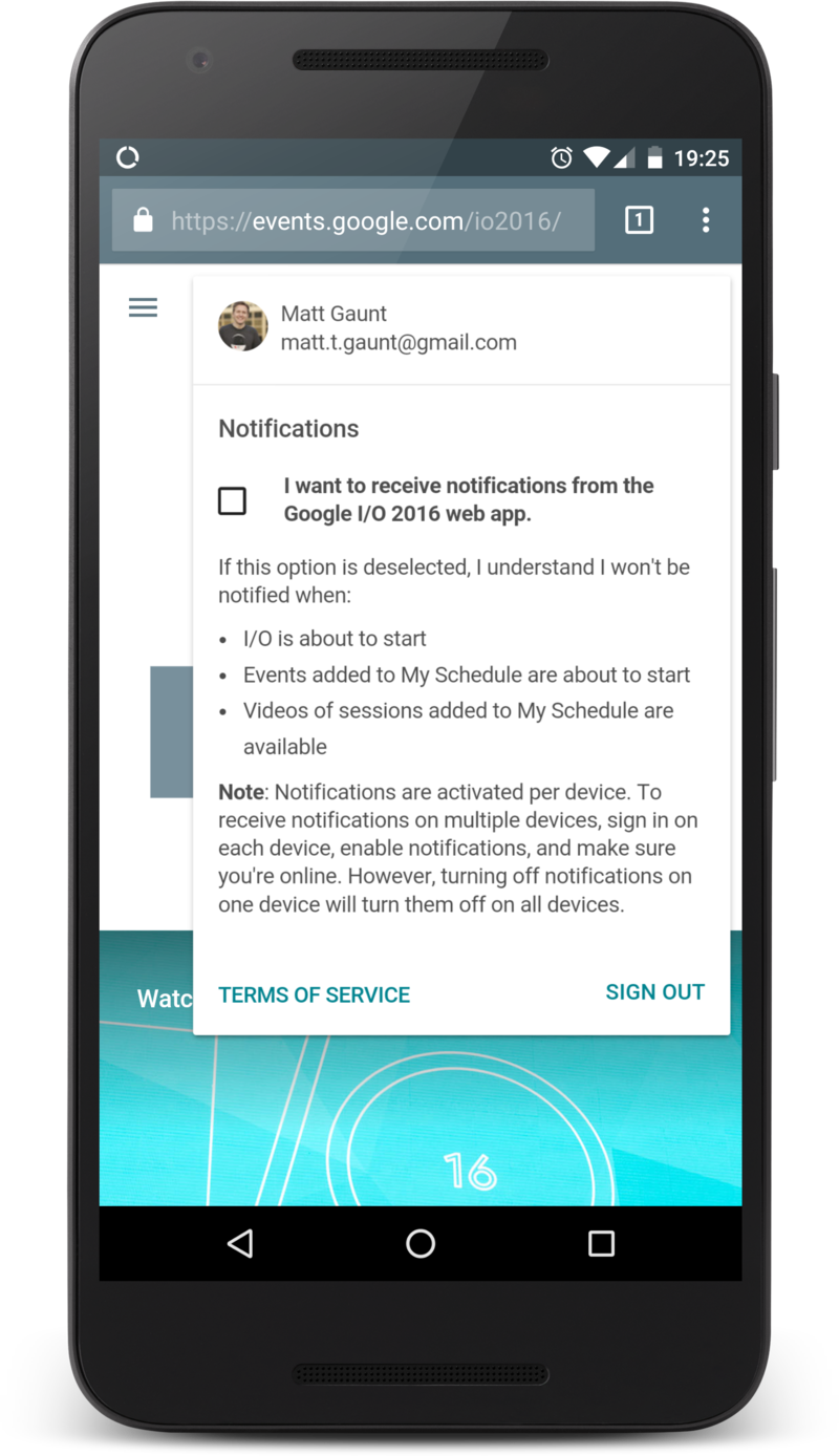
Clicking on the checkbox displays the permission prompt. No hidden surprises.
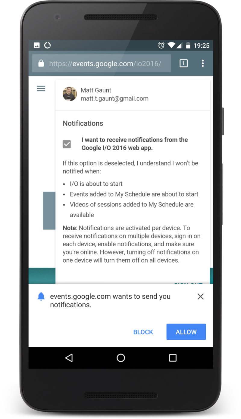
After the permission has been granted the checkbox is checked and the user is good to go. The great thing about this UI is that users can enable and disable notifications from one location on the website.
Slack also does a good job at giving users control over their notifications. They offer a host of options allowing users to customise the notifications they receive.
Passive Approach
One of the easiest ways to offer push to a user is to have a button or toggle switch that enables / disables push messages in a location on the page that is consistent throughout a site.
This doesn’t drive users to enable push notifications, but offers a reliable and easy way for users to opt in and out of engaging with your website. For sites like blogs that might have some regular viewers as well as high bounce rates, this is a solid option as it targets regular viewers without annoying drive-by visitors.
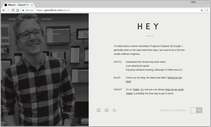
On my personal site I have a toggle switch for push messaging in the footer.

It’s fairly out of the way, but for regular visitors it should get enough attention from readers wanting to get updates. One-time visitors are completely unaffected.
If the user subscribes to push messaging, the state of the toggle switch changes and maintains state throughout the site.
The Bad UX
Those are some of the common practices I’ve noticed on the web. Sadly, there is one very common bad practice.
The worst thing you can do is instantly show the permission dialog to users as soon as they land on your site.
They have zero context on why they are being asked for a permission, they may not even know what your website is for, what it does or what it offers. Blocking permissions at this point out of frustration is not uncommon, this pop-up is getting in the way of what they are trying to do.
Remember, if the user blocks the permission request, your web app can’t ask for permission again. To get permission after being blocked the user has to change the permission in the browsers UI and doing so is not easy, obvious or fun for the user.
No matter what, don’t ask for permission as soon as the user opens your site, consider some other UI or approach that has an incentive for the user to grant permission.
Offer a Way Out
In addition to considering the UX to subscribe a user to push, please consider how a user should unsubscribe or opt out of push messaging.
The number of sites that ask for permission as soon as the page load and then offers no UI for disabling push notifications is astounding.
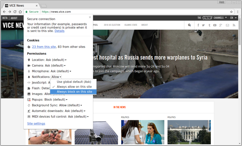
Vice News is an example of this practice. (p.s. sorry Vice for using you as an example, you were first site I recalled doing this, although I believe it’s fixed now.)
When you land on Vice News you’d get the permission prompt. This isn’t the end of the world, but it does offend the senses.

If you allow notifications, where would you go to disable them? The websites UI doesn’t change at all.

This UX pushes the responsibility of notification management onto the browser, which frankly is awful in Chrome.
As a result, sites are getting users signed up, then forcing them to trial and error their way through the browser UX to disable notifications.
If you’re curious what the Browser UX is for disabling push, the desktop has two options. You can visit the web page and click the padlock in the URL bar to configure permissions.
If the web page is closed, users can click the cog on a notification, which takes the user to this page in the settings of Chrome.
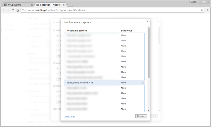
Neither of these options are particularly pleasant for the user.
Your site should explain to your users how they can disable push. If you don’t, users are likely to take the nuclear option and block permission permanently.